Concurra posed a unique question: there are products for website analytics, heatmapping, click tracking, and A/B testing, but what happens when combine them all into one? Could we automatically make better, informed decisions about our websites and increase conversions? Concurra says yes.
Brand
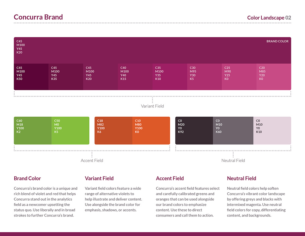
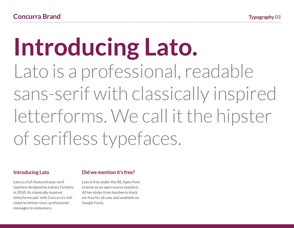
Concurra's brand features a beautiful stylized 'C' wrapped in slices of a pie chart to tie in Concurra's data-centric methodology. Lato was the typeface of choice featuring classical letterforms with a modern twist.
Math & Science icons including beakers, test tubes, equations, and microscopes are added to recall the mad scientist marketer creating hypotheses and conducting experiments.
Public Website
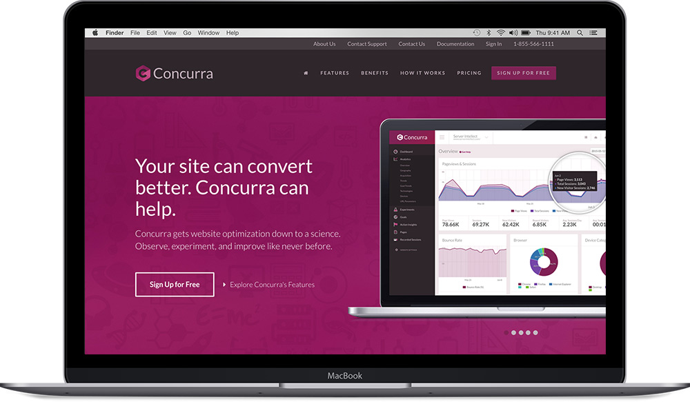
Concurra's public website draws users to their product with clear headlines and calls to action. It boasts a full responsive and device independent experience with rich iconography and plenty of product visibility.


Web Application
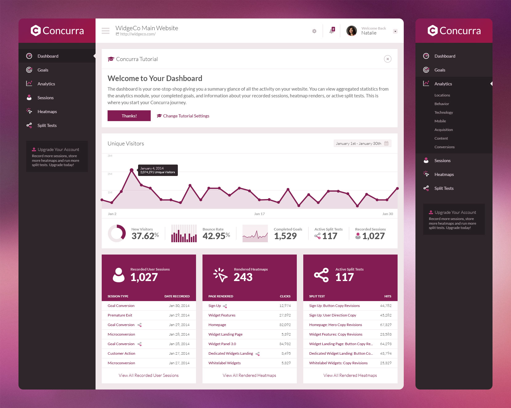
Concurra's web application was a beast of an interface featuring a full A/B testing suite, analytics, session playback, and heatmapping.
Extensive planning went into delivering a full business-in-a-box including an administrative panel, credit card billing capabilities, and comprehensive user management.


